Development of the new charteredabs.org website
Success Achieved
How the Chartered Association of Business Schools increased the site visits to 80% and the page views to 700%.
Organisation
| Name: | Chartered Association of Business Schools |

|
|
| Member geography: | National |
| Based in: | United Kingdom |
| Website: | https://charteredabs.org |
Introduction
In conjunction with the launch of our new brand this was an opportunity to create a fresh website fit for purpose.
Discovery
The old website was ‘broken’, visually out-of-date and carried our old logo. It was very difficult to navigate and led users into dead ends. The back-end CMS was difficult to use and wasn’t integrated with our CRM.
Objectives
We wanted to create a website that would become a destination for our members and the wider business school community.
Measurable targets:
- Web traffic (visits, users and returning users)
- Content supplied by members
Project period
December 2014 - December 2015
Project Team
- Barney Roe, Director of Communications & External Relations
- Melissa Jumbo, Communications & Digital Content Officer
Tools & systems
- Salesforce
- Javascript
- HTML5
- Google Analytics
Project Partners
We used an agency called Serious to develop the website and design our new brand. Following our creative brief, they first produced our new logo and brand identity.
They were then responsible for the technical build of the website. They worked brilliantly with us as an extension of our Communications team which was focused on the content, messaging and preparing for the external facing launch.
Activities
On May 5th 2015 we announced that we had received our Royal Charter, and launched our new brand and website. We recognise that by delivering benefits to the individuals who work in our member business schools that we will deliver value to the business schools.
Our website architecture, and associated content strategy, was therefore designed around our audience segments which are based on the senior management job functions in business schools. All our content is tagged by audience category and topic which allows our users to easily see, filter and search for content relevant to them.
Each page then displays other articles, events and publications the user will be interested in, encouraging them to keep clicking.
Through integration with our new Salesforce CRM, the website is enabling us to personalise all our communications and steer our members to content, products and services relevant to individuals’ interests and job roles. Our registration forms have been mapped against the fields in our CRM. In addition to standard contact data we are also collecting information about the job roles individuals are in, as well as the events and publications they are signing up to. In order to join up our communications systems we have also mapped our email broadcast system to our CRM so we can track which stories and events our contacts click on in our outbound communications.
Using the data we gather through the website registrations, coupled with open and click activity, we are able to develop targeted communications campaigns to provide individuals with content that is relevant to them. Then, once they arrive on the website each piece of content is tagged and categorised so they can filter and easily identify content of interest to them. Each page will promote content with the same tags to the user through the dynamic widgets in the side bar menus. This approach has helped us achieve our goals in creating a ‘sticky’ website and in driving up engagement in our activities.
Having good content has proved to be essential. All our offline engagements (events, meetings and contact) with our members are seen as opportunities to ask members to provide content (blogs, case studies and news). A steady flow of engaging content helps keep our users on our website for longer, visiting more pages and more likely to return. They return either through choice or through our newsletters and marketing which now contain the excellent content provided by the members themselves. It’s a virtuous circle.
Event bookings are taken through a new online payment system which has also been integrated into the website.
We also gave members a profile with administrative user access to areas of the site so that they can upload jobs and maintain their profiles in our membership directory.
The website has also been populated by images from the membership to ensure we can best represent the fantastic diversity of business schools in the UK in an authentic way. Stock images are now a rare sight on the website.
The website was designed with mobile and tablet users in mind, taking a ‘mobile first’ approach to how we display information to visitors. To achieve this we adopted a modular design method, building elements rather than whole pages to allow us to make sure each component that was built would work across different devices.
To enable the site to work from desktops to mobiles we used a responsive framework. We ensured the site navigation was usable on smaller screen sizes and navigable by touch. We used web technologies that are mobile friendly, including Javascript and HTML5.
To optimise speed for mobile users we created a site that provided accessibility and a fast browsing experience by compressing our code and optimising images to speed up delivery over mobile networks. We used a Content Delivery Network improve page speed.
Staff and time involved:
- All staff were involved at one point or another. The project was kicked off with a branding workshop
- During the website build the bulk of the work for a 5 month period was undertaken by the Director of Communications & External Relations and the Communications & Digital Content Officer. The build itself was outsourced to a digital and design agency
Challenges
Ensuring the integrations with the CRM and the web payment platform were seamless. We overcame this challenge through the expertise of third parties and through testing.
Achievements
Our previous website was painfully difficult to navigate and often took users to micro-sites or third party websites, such as that run by our contracted events partner. Our new website was designed with the ‘member’ user in mind – their profile and their interests. We set the objective of becoming a destination website – somewhere our audience would visit by choice rather than because we had pushed them there from a marketing email. When members arrived we wanted them to stay and explore other related content.
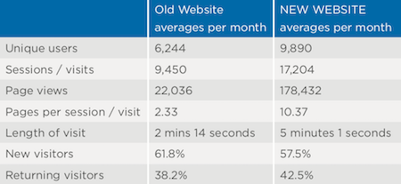
Our audience tags have helped us achieve this. We can now see that people are spending longer on site, visiting more pages and that we are getting more returning visitors each month.
In the first couple of months of our website we wanted to see high new visitor rates, which we achieved with a rate of 63% new visitors. A measure of whether the website has become a destination will be if we see users returning, and we are delighted to see that last month the majority of our users (56%) are now returning visitors.
Our members account for 53% of visitors. As they are the authors of much of our content and many are seeking to raise their international profile, they are benefitting from our international non-member readership which stands at 47%. We have seen some of our blogs and publications shared by non-members across Europe, USA and Australia.
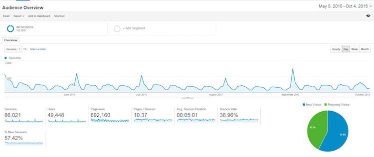
Visits to website - May to October 2015
Our success is also due to making the website central to the integration of a number key strategies around content, ITC systematisation (including CRM), events, and finance. One piece of content in particular we identified as being particularly valuable to our web users, from both within and outside our membership, so we decided to put it behind a registration and log in page.
As a result of this joined up approach our database has grown by approximately 5,000 (30%) through registrations on the website in the 5 months since launch. At the same time, we brought our events in-house and, by marketing to our rapidly growing and highly targeted membership database, supported by online content, our website booking system has since taken 67% of our annual target already.
We’ve seen an increase of 45% in mobile traffic with these users spending over 70% longer on the site than previously.
A 50% increase in the number of new visitors to the site using mobile/tablet devices and a 36% increase in the number of people returning hopefully demonstrates that our content and the sites approach to mobile friendliness is resonating with users.
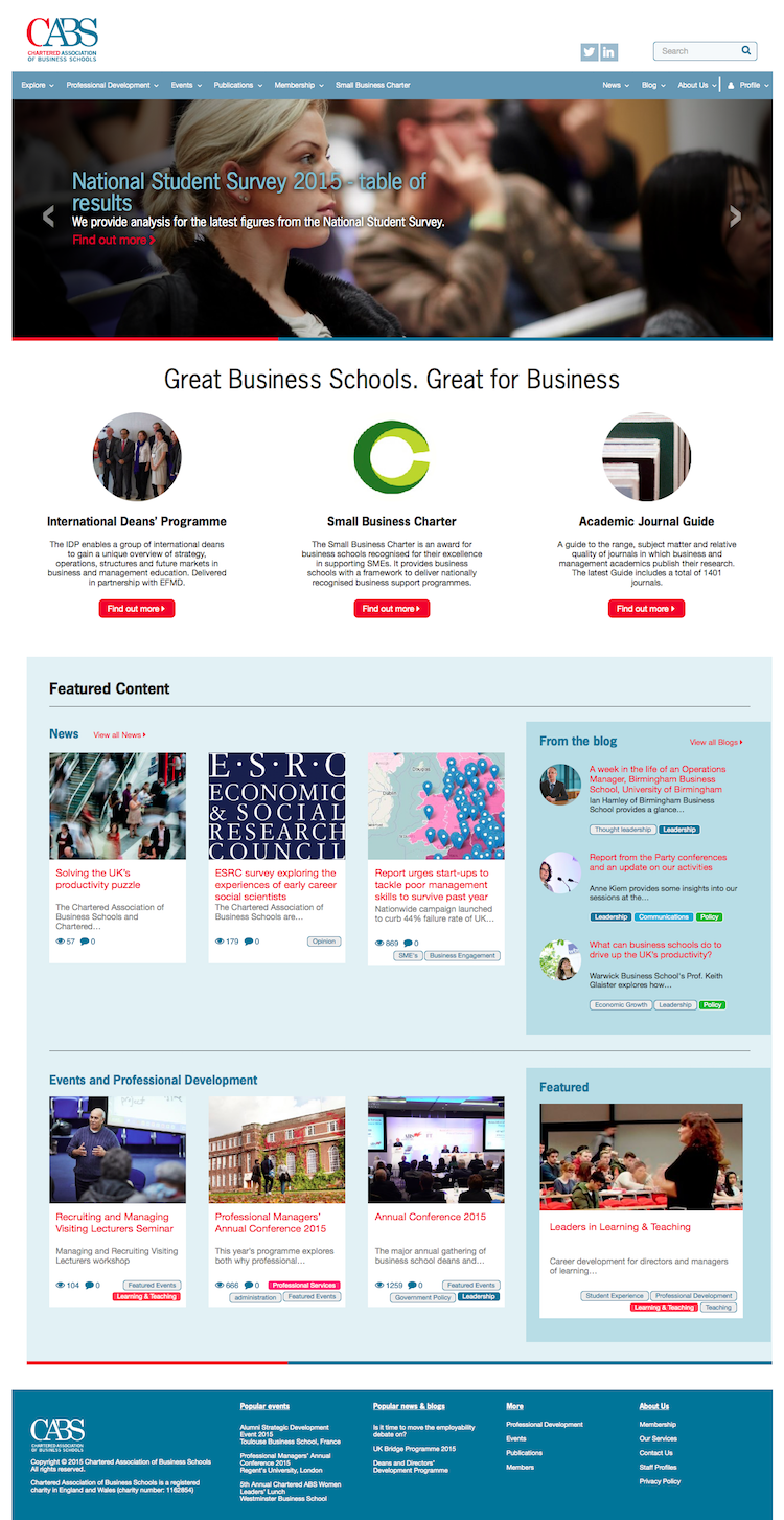
Website homepage
Wider impact
The website has been transformational to our communications, how we engage with our members and has also delivered efficiencies to our in-house systems and processes.